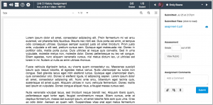
In this release, Instructure has announced an updated Speedgrader user interface. The new interface is likely to appear in Canvas in about three weeks. The most noticeable change is that the student roster menu has moved from the left to the right. The roster’s background has also been changed to match the background of the menu bar, which makes it harder to see.
The rationale for the left-right swap is that by moving all the most frequently used buttons to the same area of the screen, the new UI improves efficiency. Change always feels bad at some level when it is new, and I do think it would have been better had they kept the higher contrast background for at least a semester or two to help instructors locate the newly positioned menu. That said, I agree that reducing the distance between frequently accessed buttons is a good thing.


